OVERVIEW
In our information visualization project we were interested in the side effects of the
COVID-19
pandemic and if there might also be positive effects such as lower CO2
emissions. To visualize whether COVID-19 led to a change in CO2 emissions, we
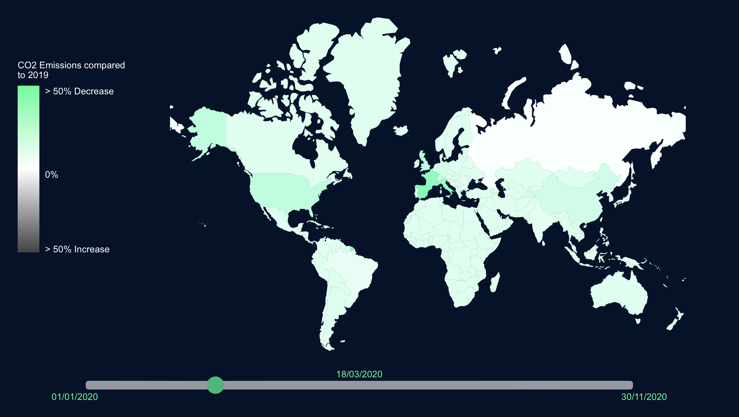
implemented an emissions dashboard website. The first part of our website consists of a map
visualization showing the change of CO2 emissions per country compared to the
year prior to the pandemic (2019). We implemented a slider to enable users to navigate
between days and see how the emissions changed throughout the year.
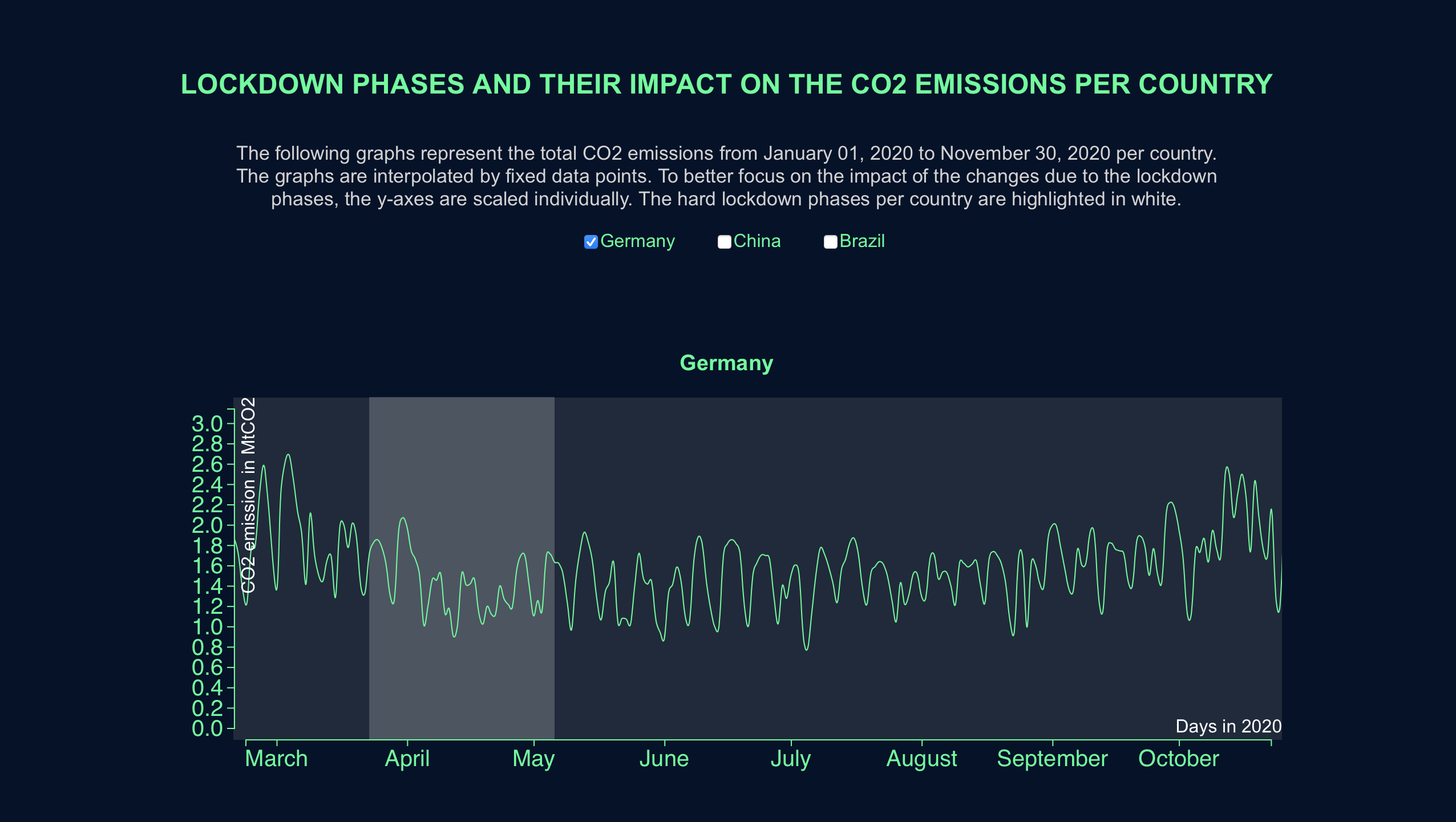
The second part of our dashboard is a graph visualization which shows hard lockdown phases
and gives a more detailed overview of how
CO2 emissions changed throughout the year. We included three countries that can
be selected to show them next to each other for deeper comparisons. The graphs are
interactive and can be scrolled in as well as provide detailled CO2 values on
hover.
MY ROLE
Information visualization group project. I was responsible for data preparation and implementation of the map visualization including slider and interactions. I also contributed to the single country graphs implementation as well as concept development.
TECHNOLOGIES
HTML • CSS • React • D3
TIMELINE
November 2020 - January 2021

